Selling your products online is an amazing way to grow your business and reach a bigger customer base. Unlike a physical shop front it is open 24 hours a day, 7 days a week – promoting you, informing visitors who you are and generating sales of your products and services.
But what if the website that you’ve invested serious money into is actually annoying visitors instead of encouraging them to buy what you are selling? If this is you, don’t worry. It happens more than you think. I’ve worked with many small business owners who have an ecommerce website but struggle to get any sales. And it’s not because they don’t have a great product to sell, they do, generally, it’s due to not implementing an effective strategy while designing the website.
Today, I want to share with you 6 ways your ecommerce website annoys customers and how you can avoid them.
1 // No Contact Information
Hiding or making it difficult to find your contact information is a surefire way to irritate customers on your website.
People interested in your products or services need to know that you are contactable before, during and after the sale. Not having your contact information readily available makes buyers uneasy, as it leads to thinking that you are not able to provide support should they need it.
Ideally, your contact information should be displayed on every page. Common areas are along the top and in the footer as well as a ‘contact’ navigation link in the main menu.
Related posts:
2 // Confusing navigation
As busy consumers, we are increasingly eager to find what we’re looking for quickly and efficiently. We don’t want to search through your entire website to find out if you have the product or service we want. We want to know straight from your homepage or within a few short clicks that we’ve come to the right place.
Confusing your website visitors with complicated navigation is just going to frustrate them to the point that they leave and move on to your competitor.
- Keep the navigation labels clear – don’t give pages some obscure names that make sense to you but mean nothing to your customers.
- Don’t overload your menu – it can be tempting to include every single page in your main menu but this can be overwhelming.
- Keep labels short – try not to use too many words for the navigation item. For example, ‘Read Our Testimonials’ could be shortened to ‘Testimonials’.
- Don’t hide your menu – ever been on a site and can’t find the navigation? It’s annoying. Fancy slide out buttons might look cool but they can frustrate someone just trying to move around your website.
3 // Vague descriptions and rubbish photos
Buying online is vastly different to going into a shop and purchasing an item. You can touch the product, try it out and get a better feel of what it is your buying. Online shopping doesn’t give you that luxury, you instead have to rely on photos and the product description.
Ensuring you have a detailed description of each product including any materials, ingredients and features will help customers make informed decisions. Personally, if there is a limited or missing description for a product, I’m unlikely to even consider making a purchase.
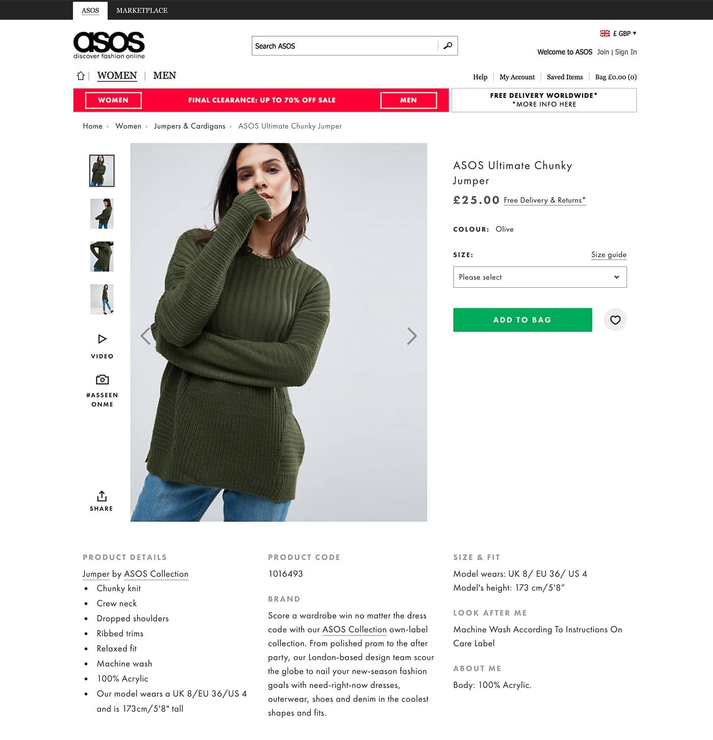
A good example of providing the ideal product description on asos.com – they give you the full item details, washing instructions, brand info and size guide. It contains everything you need to know

The photos you use are also an important factor for customers. Having bright, clear photos of your products will sell 100 times better than using dark, blurry images. Again the example above from ASOS shows first-hand the benefit of using high-quality images and showing the item in different views.
Another way they utilise images is by sharing customer photos wearing the item. This is fantastic way to show additional images but it has the added bonus of getting customers to engage with your brand post sale.
![]()
4 // Your website isn’t mobile-friendly.
This may seem like a no-brainer but it’s still common to see websites that aren’t mobile-friendly. Say what?!
Visits to websites on mobile phones are increasing year-on-year and towards the end of last year actually surpassed desktop views.
If your website isn’t mobile-friendly, you are potentially losing out on sales from customers who can’t (or don’t want the hassle) of trying to view your website on their tablets or phones.
Having to zoom and pinch the screen to read the text on the page is creating a barrier with your customers that doesn’t need to be there.
By creating a positive, user-friendly experience will minimise the chances of a lost sale.
5 // Hidden costs
Have you ever been on a website, you get excited about a product but you can’t find the total price? Or been tempted with the free delivery offer advertised throughout the site, only to find that there is actually an expensive charge once you get to checkout? It’s annoying and also feels a little deceptive. While you may get some people who continue to buy since they have came so far, others will leave your website and you lose the sale.
Be upfront and clear about any additional costs on the product page. Don’t leave it till the checkout page to inform customers of an extra cost or expensive delivery charges.
6 // Complicated ordering & checkout process
Nothing frustrates customers more than an overly complicated order process. Having too many steps to checkout from your shop is going to increase the likelihood of an abandoned cart.
Checking out should be streamlined. Long checkout processes make the customer lose interest.
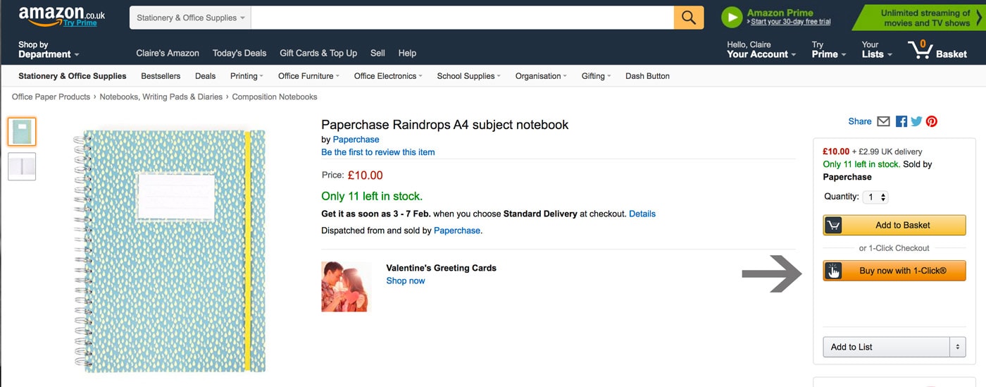
Amazon, for example, offers a “1-Click Ordering” option which bypasses the shopping basket completely allowing you to purchase the item with a simple click.

You can improve checkout process by:
- Providing a guest checkout – don’t force customers to have to sign up for account
- Show a visual representation of process e.g step 1 of 3
- Give customers the option to save their cart items or add them to a wishlist to buy later.
- Don’t ask for too much information – only collect the details you need to complete the order.
- Ensure your forms are easy to fill in
- Show that your website and payment gateway are secure
Final thoughts…
If you’re a small business considering selling online or you’re already set up to sell but having trouble generating sales – it can be easy to feel overwhelmed and frustrated. But it doesn’t have to be that way.
By developing an effective strategy while you are designing the website you can focus on making the most of your website and creating a user-friendly buying environment for your customers.
The 6 tips I’ve shared above can help you improve your ecommerce website and make your customers love shopping with you.
If you would like a detailed analysis of your website, enquire about my consulting service.
Or you would like to discuss working together to create a goal-oriented website, get in touch for a free no-obligation chat.
Find out the 6 ways your ecommerce website annoys your customers & costs you sales. Click to Tweet
Share this with your pals...